Continuing on from an earlier post, I’ve had to make up my own notation on occasion and I’d like to talk about some things that felt good but are probably mistakes in the long run.
Starting with this piece of smartarsery1:
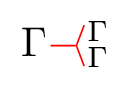
For reasons I’ll talk about in another post, the red branching shape in the middle is syntax for a “duplication constraint” - insisting that the context on the left is equal to both the contexts on the right. When it’s used to describe an otherwise-normal typechecker, this amounts to passing the left-hand context twice.
Hence the branch - it’s describing a branch in dataflow! But aside from the accessibility issues around colour-coding and bright red2 this is a pretty bad idea for anything aside from pen and paper or whiteboard work. Why?
- I hacked the glyph up in LaTeX with negative hspace and the \langle character - I have no business expecting others to reverse engineer it!
- It uses superscripting and subscripting, so the duplicated contexts render smaller and the issues from the previous post crop up again
- For whiteboard work it often makes more sense vertically anyway
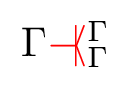
I do have a workaround for the super/subscript issue, I ended up needing this n-ary version anyway:
But for reasons involving quantities I’ve even perpetrated these!:

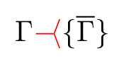
I think it’s time I start writing things like dup(τ)(τ,τ) or dup(τ){τ, τ, τ} instead.